To design a global set of responsive templates, that could be implemented across Incisive Media’s brands’ mobile sites for phone and tablet devices
Client: Incisive Media
Date: 2013
Platform: Mobile & Tablets
Incisive Media’s brands’ mobile sites were out-dated and did not provide users with a good browsing experience. With over 30 brands using the same templates, we needed to come up with a new set that could be flexible to accommodate these different brands, as well as provide users with a better experience on their devices.
A library of global components that can be customised by each brand to use for their website, as well as a responsive prototype.
You can view a snippet of the paper prototype video here (in mp4 format)

Paper prototype for Nexus 7 (landscape)

UX workshop brainstorm for design improvements
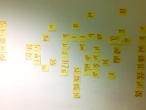
UX workshop brainstorm with Post-it notes

Competitor analysis - these ranges from mobile to tablet to desktop sites
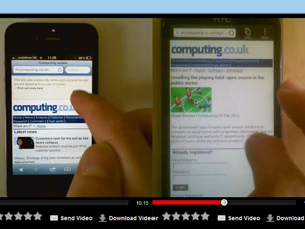
Users browsed 5 different mobile websites on various phones

Storyboard scenarios of users using their mobile whilst on the move

Identifying user types & key entry points to our mobile sites
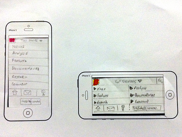
Paper prototype for iPhone 5

Paper prototype for Android phone

Paper prototype for Nexus 7 (portrait)
Paper prototype for Nexus 7 (landscape)
UX workshop brainstorm for design improvements
